Control
Risk management software
Role
Lead UX Designer
Responsibilities
Elicit direction from stakeholders
Wireframe & design features for engineering
Clearly convey order limit definitions, creation, missing limits, and order history
Team members
Anthony Foster, VP of UX/UI
Jeff Hyun, Lead, Full stack
At this point during my time at Lucera Financial Infrastructures, I had learned all there was about US Treasury trading, and started to become familiar with European markets as well. We had launched Treasury into Production, and shortly behind it our currency exchange platform. It wasn’t too long after that I caught wind of what was referred to as risk management.
Risk managers, in my own words, ensure the organization doesn’t lose too much money. No risk, no reward.
Control was created for risk managers. It was spec’d to be a one stop shop for markets in the US and Europe. Monitor trading risks, assess loss, kill trades, and define some other godly-financial-data that is still way over my head.
The hitch? Control had to be flexible enough to connect, collect, and override trades from Lucera trading applications as well as other trading applications from competitors. The UI for Control was never launched to Production, but it’s Java middleware is ongoing with Bank of America Merrill Lynch. We did however, still make a logo for when they’re ready.
The following screens are a sample of the work that went into designing Control.
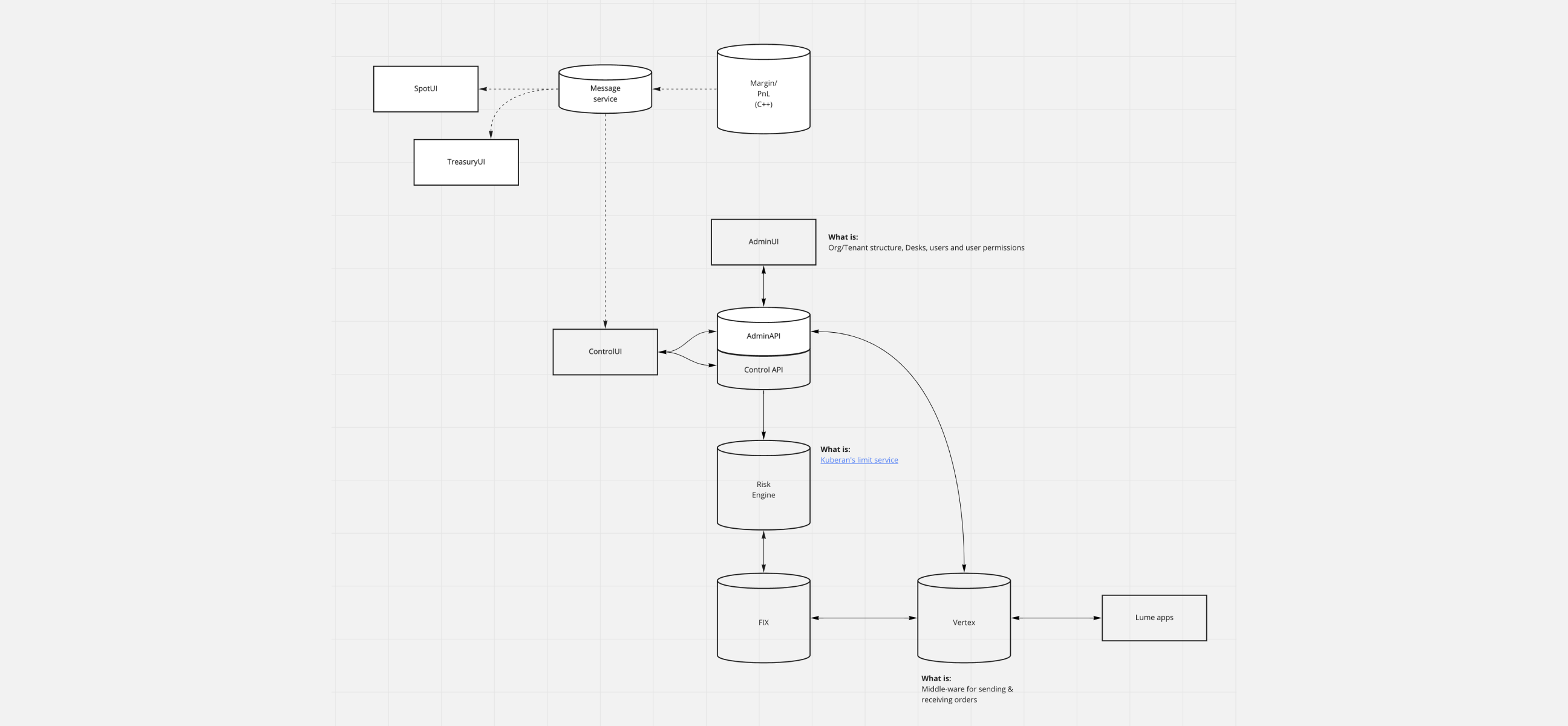
Evaluating the system and what services would be involved in pulling & overriding data.
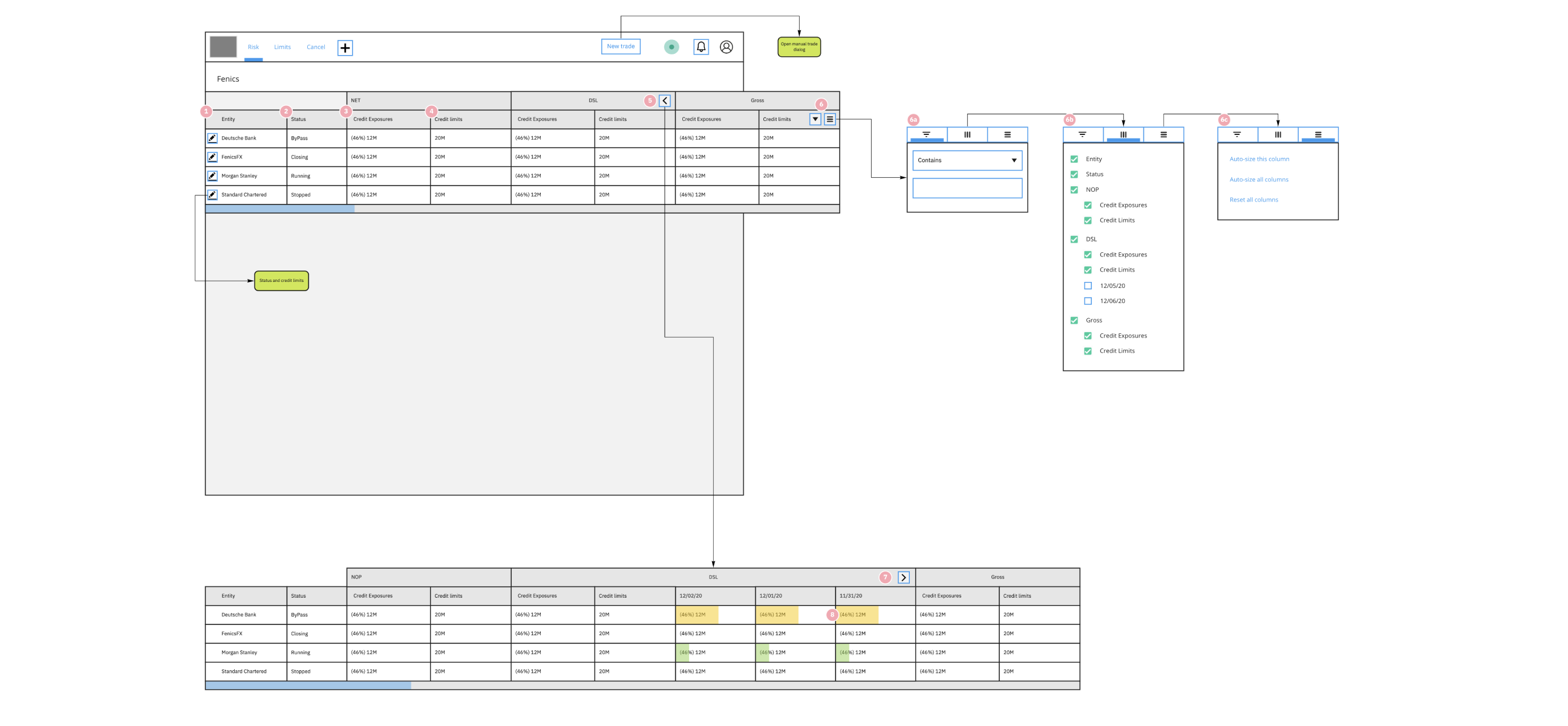
Early stage wireframe.
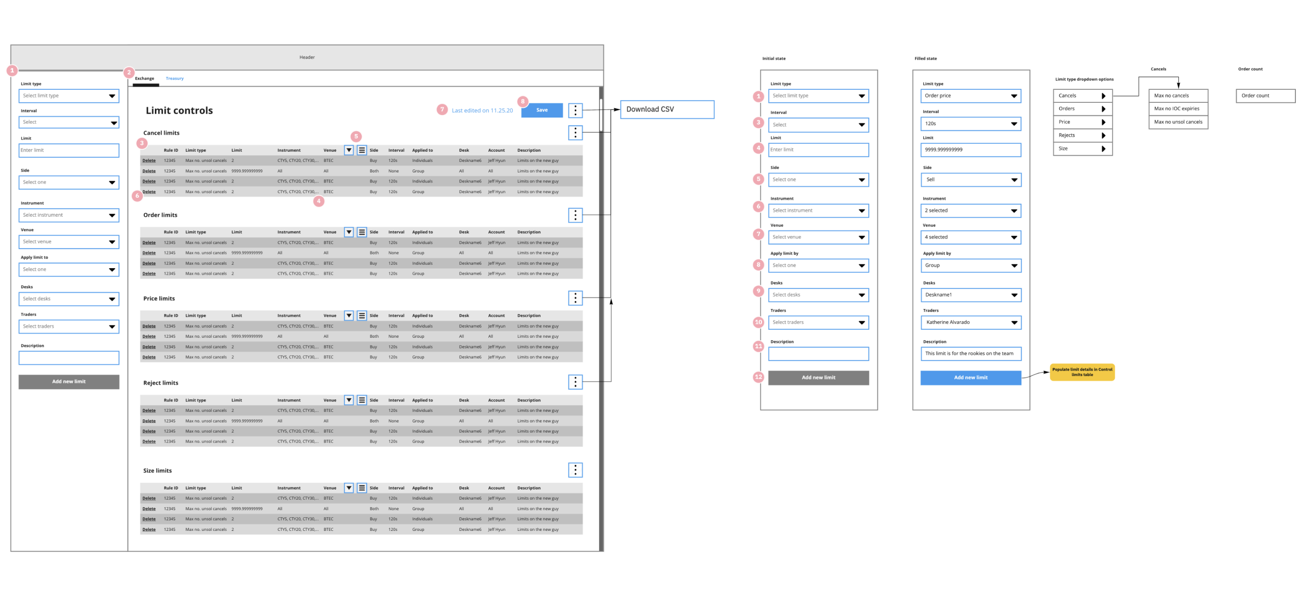
Close to the final wireframe.
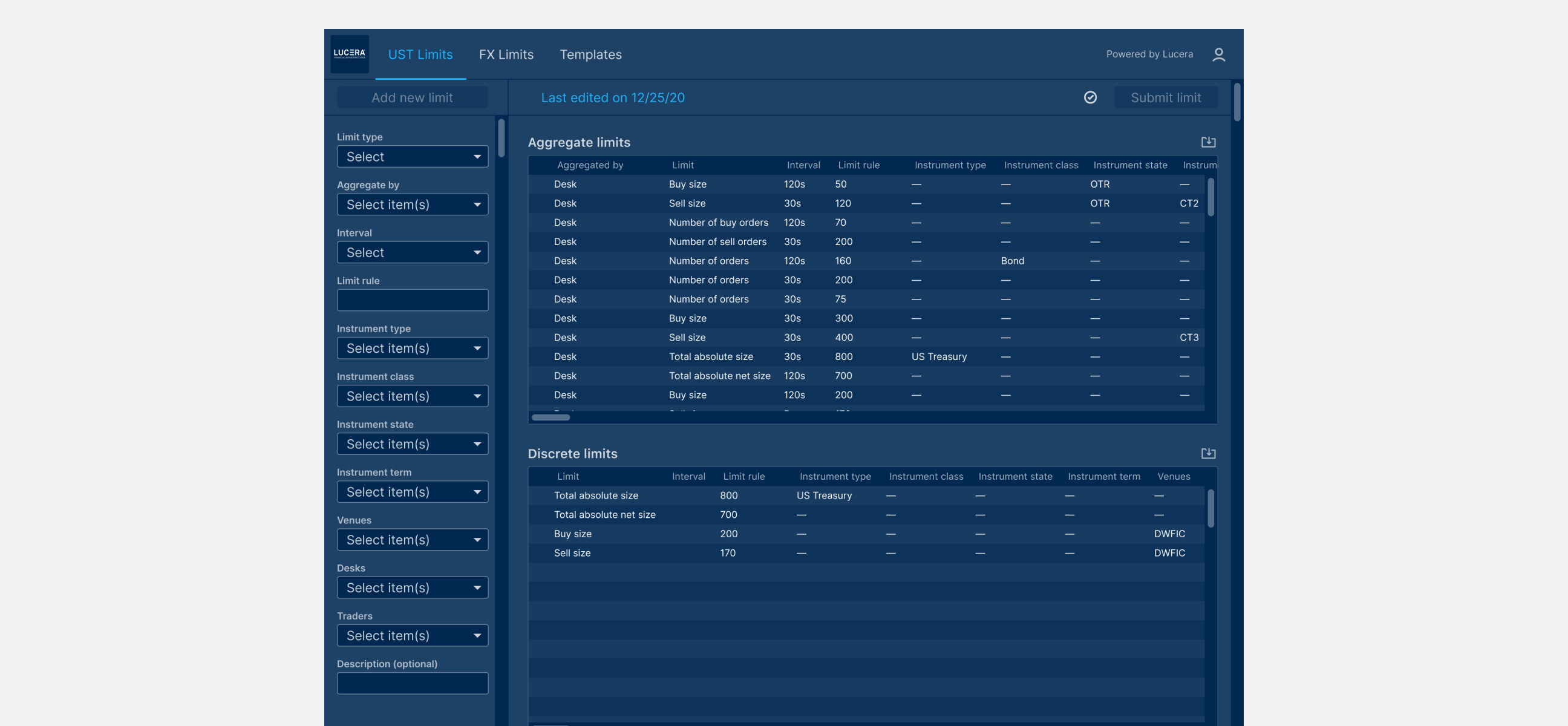
Dashboard of US trading limits
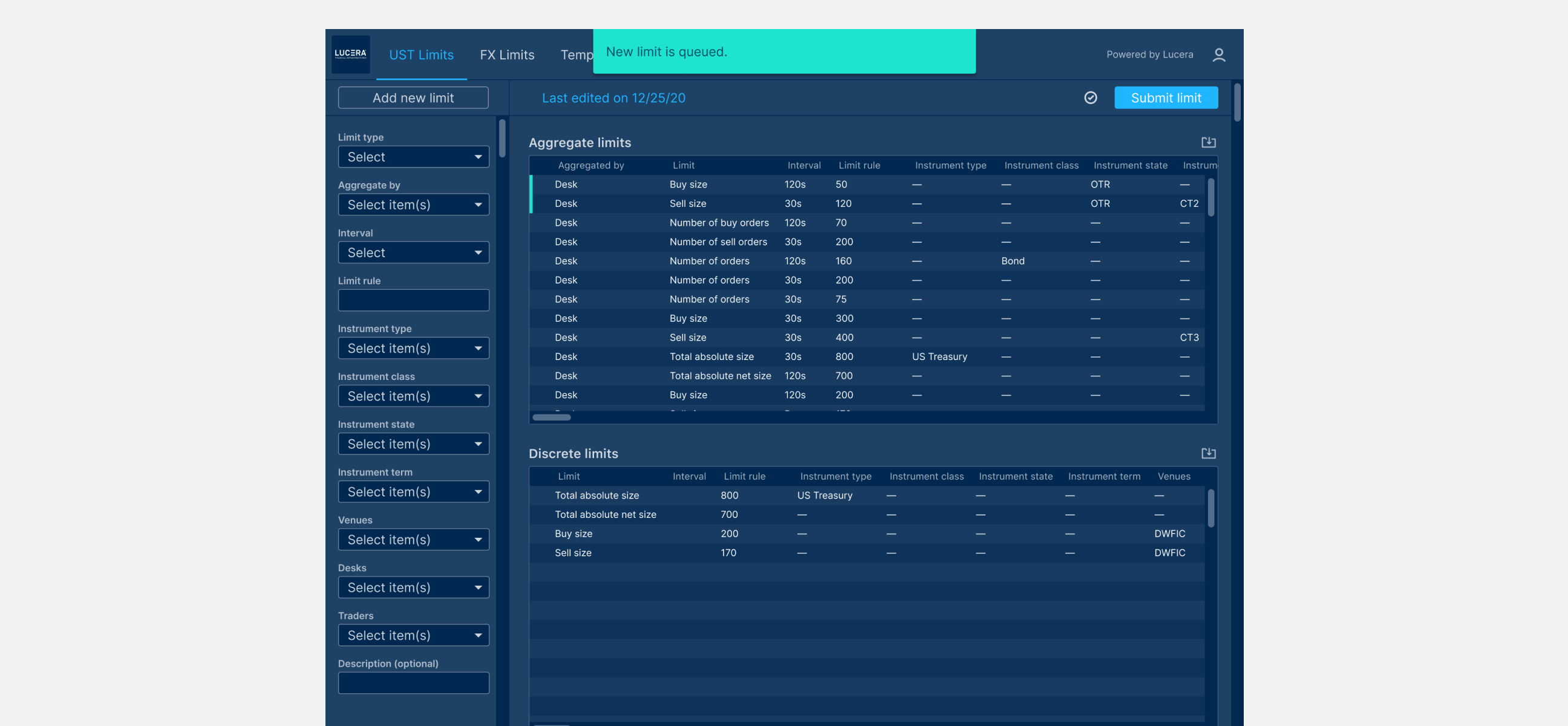
Toast message and row highlights when a new limit has been queued.
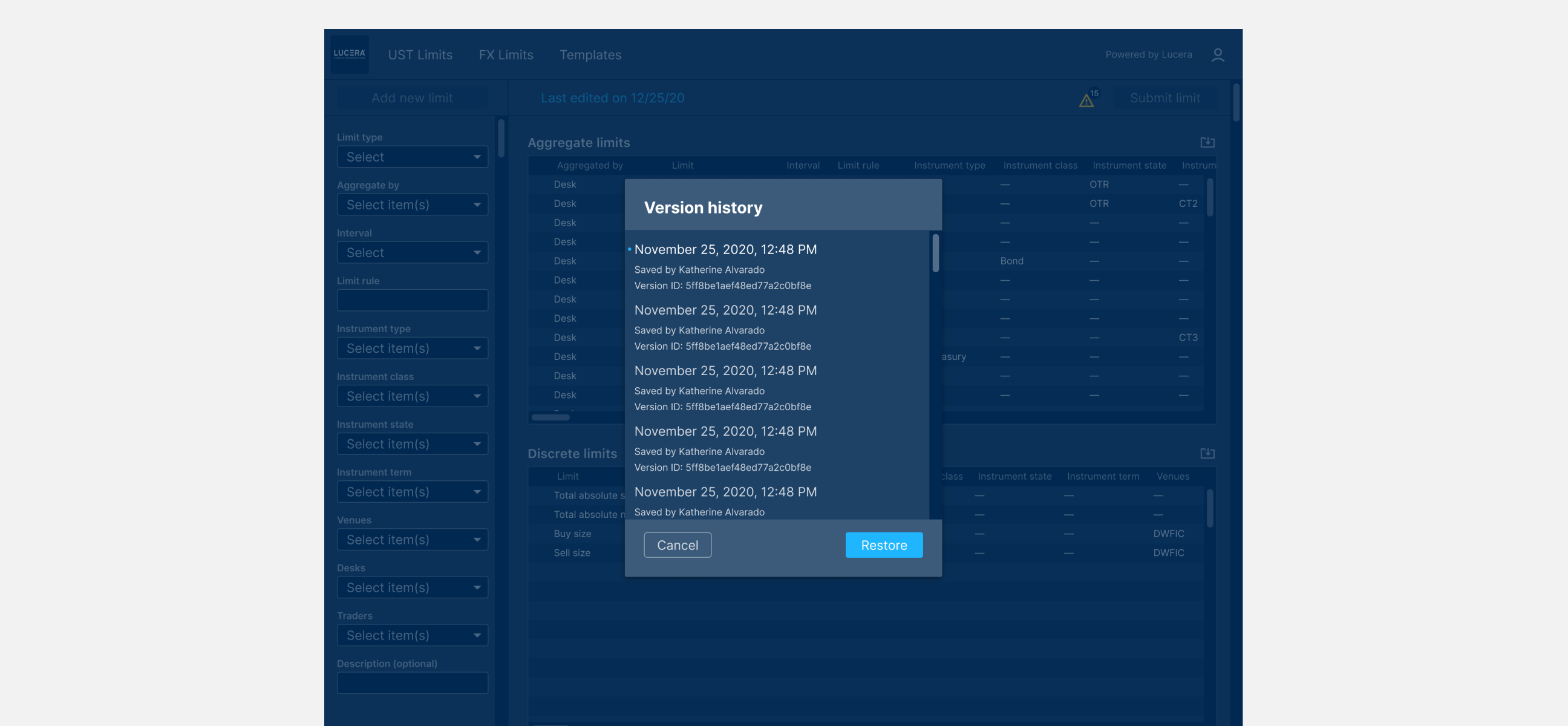
Version history tracked any changes made to trading limits.
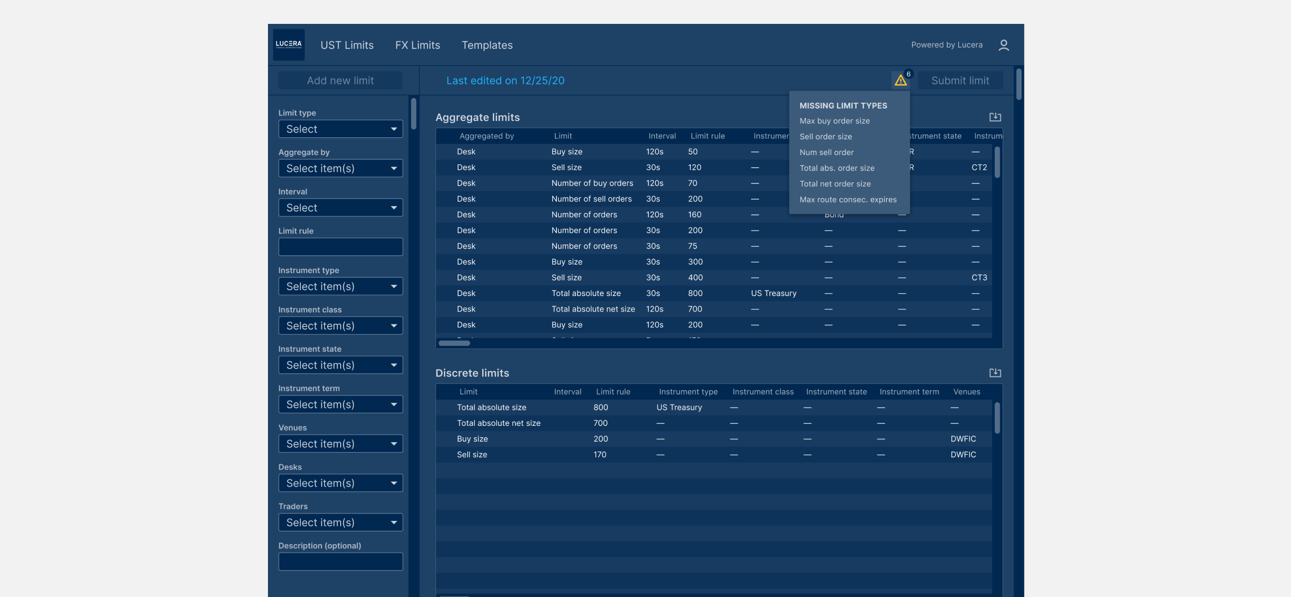
Limit checklist feature to inform risk managers of rules missing for a limit type.

Our team also had the opportunity to work on the logo.